Network Analysis on USA Airports
Community detection algorithms: Cliques, Edge-betweenness, Leading eigenvector, Fast-greedy, Louvain, Walktrap, Label propagation, InfoMAP, Spinglass
The purpose of this project is to gain insights from a network analysis of USA airports. This network consists of passenger flights between airports in the United States that occurred during December of 2010.
The data comes from the Research and Innovative Technology Administration (RITA). See http://www.rita.dot.gov/about_rita/ for details. The airport position information was collected from Wikipedia (by Gabor) and other public online sources.
The dataset is a directed network with edge directions aligning with flight directions. The network contains multiple edges between many vertices. Each edge is associated with a single carrier aircraft type. Multiple carriers between the same pair of airports will have multiple edges between the vertices for the airports. This kind of network is sometimes called a multigraph. In total the network has 755 vertices and 23,473 edges.
The analysis was performed in R using the igraphdata package, written by Gabor Csardi (Gabor, 2015). He also maintains the package. The package is available in the CRAN repository (https://cran.r-project.org/web/packages/igraphdata/igraphdata.pdf). This package consists of a collection of network datasets to use with the igraph package. Examples of these datasets are: The Enron email network, various food webs, interactions in the immunoglobulin protein, the karate club network, Koenigsberg's bridges, visuotactile brain areas of the macaque monkey, UK faculty friendship network, and the domestic US flights network.
I will start by working with the complete dataset. The dataset will be slimmed down progressively until I arrive at a suitable subset for my purposes. I have a general interest in the operations of airlines. In addition, the network seemed rich in terms of the number of attributes and the multiplicity of edges.
Next, I will describe the attributes included with the network. The network has a ‘name’ graph attribute. It also has several vertex and edge attributes.
- name: Symbolic vertex name, this is the three letter IATA airport code.
- City: City and state, where the airport is located.
- Position: Position of the airport, in WGS coordinates.
- Carrier: Name of the airline. The network includes both domestic and international carriers that performed at least one flight in December of 2010.
- Departures: The number of departures (for a given airline and aircraft type.
- Seats: The total number of seats available on the flights carried out by a given airline, using a given aircraft type.
- Passengers: The total number of passengers on the flights carried out by a given airline, using a given aircraft type.
- Aircraft: Type of the aircraft.
- Distance: The distance between the two airports, in miles.
Although the terms “node” and “link” (rather than vertex and edge) are more digestible to the general reader, I have decided, for the sake of preciseness, to use the more technical vertex and edge. This usage will be extended to the visualizations as well.
A summary of this network in R confirms that it is directed and named. It is not bipartite; neither is it weighted. There are, however, edge attributes that can be used to make it weighted.
> summary(usa)
IGRAPH bf6202d DN-- 755 23473 -- US airports
+ attr:name (g/c), name (v/c), City (v/c), Position (v/c), Carrier (e/c), Departures (e/n),| Seats (e/n), Passengers (e/n), Aircraft (e/n), Distance (e/n)
Figure 1 shows a visualization of the network. Note that the size of vertices has been made proportional to the log of the degree due to the large variation of the degree of vertices. The symbolic vertex names (airport codes) are not shown to improve clarity. There are 755 vertices and 23,473 edges (although this is not apparent from the visualization). It is quite clear that, as we might expect, that this is a scale-free (rather than a random) network. A number of prominent, highly connected vertices are easy to spot. Another characteristic of this network is its apparent partitioning of vertices into a number of cohesive subgroups. There seems to be two main subgroups and several smaller ones. There are even small “islands” of a few connected vertices. The visualization reveals the presence of some self-loops in the network.
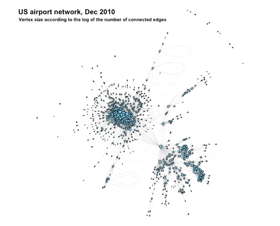
The R-code finds 53 self-loops:
> sum(which_loop(usa))
[1] 53
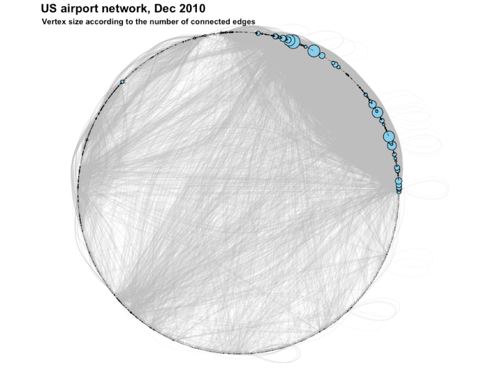
Figure 2 shows the network again, this time without taking the log of the degree. This provides some additional insights.

Figure 3 is the same as Figure 2 except that the layout of the vertices is along a circle. This visualization emphasizes how highly-connected the hub vertices are in this scale-free network.
We can approach the presence of cohesion in a network from a number of angles. One approach is to consider cliques.
A clique is a maximally complete subgraph, in other words, a subset of vertices that have all possible ties among them. Cliques are usually considered in the context of undirected networks. It is, however, somewhat interesting to pretend for a moment that our network is undirected and consider the presence of cliques.
The R code reveals that there are cliques present and that the size of the largest maximally complete subgraph is 27:
> clique.number(usa)
[1] 27
To proceed toward proper community detection, we will remove all the self-loops in the network. The occurrence of these are somewhat abnormal. They could be data errors or simply the fact that an airplane had to turn back to its takeoff airport due to problems that were experienced. As mentioned above, there are 53 self-loops in the network.
After removal, we have this network:
> summary(usa2)
IGRAPH b11c16a DN-- 755 23420 -- US airports
+ attr:name (g/c), name (v/c), City (v/c), Position (v/c), Carrier (e/c), Departures (e/n),| Seats (e/n), Passengers (e/n), Aircraft (e/n), Distance (e/n)
Next, I will simplify the network by collapsing all the multi-edges. In other words, I will turn the multigraph into a simple graph. Doing this will simplify the analysis. It does not make sense to combine the values for Carrier and Aircraft from multiple edges into a single value for my purposes. I will ignore these edge attributes. For the other edge attributes I will combine them by summing. This means I will sum all the Departures, Seats, and Passengers for all the similarly-directed edges between a given vertex pair. The network will still be directional. The Distance edge attribute values will be combined by taking the max of sets of equal values. After simplification, we have:
> summary(usa3)
IGRAPH ddbc561 DN-- 755 8228 -- US airports
+ attr:name (g/c), name (v/c), City (v/c), Position (v/c), Departures (e/n), Seats (e/n),| Passengers (e/n), Distance (e/n)
> is_simple(usa3) #confirm that usa3 is now a simple graph
[1] TRUE
Next, I will turn the graph into a weighted network. I will use the Distance edge attribute to weight each edge. After weighting, we have:
> summary(usa4)
IGRAPH ddbc561 DNW- 755 8228 -- US airports
+ attr:name (g/c), name (v/c), City (v/c), Position (v/c), Departures (e/n), Seats (e/n),| Passengers (e/n), Distance (e/n), weight (e/n)
The first ten edges now look like this:
> E(usa4)[[1:10]]+ 10/8228 edges from ddbc561 (vertex names):
   tail head tid hid Departures Seats Passengers Distance weight
1   BGR  BOS   1   2          1    34          6      201    201
2   BGR  JFK   1   4          2   525        446      382    382
3   BGR  MIA   1   6          1    12          4     1459   1459
4   BGR  EWR   1   7          4   758        680      393    393
5   BGR  DCA   1  43          4   200        116      590    590
6   BGR  DTW   1  44         55  2750       1955      750    750
7   BGR  LGA   1  57        130  6266       3640      378    378
8   BGR  PHL   1  71        100  6274       4953      473    473
9   BGR  PIE   1 157          9  1350       1198     1394   1394
10  BGR  SFB   1 370         11  1650       1491     1299   1299
After inspecting a much larger listing, we find that there are many flights with only a few passengers. This is also evident from the histogram in Figure 4. For example, there are 128 flights with a single passenger, 256 with 1 or 2 passengers, 522 with 5 or less, and 756 with 10 or fewer passengers:
> length(E(usa4)[Passengers <= 1]$Passengers)
[1] 128
> length(E(usa4)[Passengers <= 2]$Passengers)
[1] 256
> length(E(usa4)[Passengers <= 5]$Passengers)
[1] 522
> length(E(usa4)[Passengers <= 10]$Passengers)
[1] 756

Next, I will remove all these edges. In fact, I will remove all edges that have 50,000 or less passengers. After this, we have the network:
> summary(usa5)
IGRAPH 6d89fa3 DNW- 755 131 -- US airports
+ attr:name (g/c), name (v/c), City (v/c), Position (v/c), Departures (e/n), Seats (e/n),| Passengers (e/n), Distance (e/n), weight (e/n)
Next, I will remove all the isolates (vertices without any connected edges). After this step, we have:
> summary(usa5)
IGRAPH 679f9d1 DNW- 38 131 -- US airports
+ attr:name (g/c), name (v/c), City (v/c), Position (v/c), Departures (e/n), Seats (e/n),| Passengers (e/n), Distance (e/n), weight (e/n)
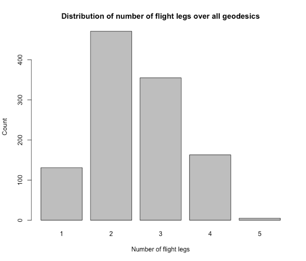
After this, we can inspect the distribution of the number of flight legs over all geodesics. This is shown in Figure 5. Most flights (in the current dataset) consists of 2 legs (i.e. one transfer). Analyzing this further could open up opportunities to establish new direct flights, or reduced-leg flights. But, this is not our purpose currently.
The next step is to convert the network to an undirected, unweighted graph. This will allow us more algorithms for the detection of communities. In converting to an undirected network, I will sum the Departures for both directions between a vertex pair. This will also be done for the edge attributes Seats and Passengers. For distance, I will take the max (of two identical numbers). The weight edge attribute will be ignored. After these operations, we have:
> summary(usa6)
IGRAPH 999ad18 UN-- 38 72 -- US airports
+ attr:name (g/c), name (v/c), City (v/c), Position (v/c), Departures (e/n), Seats (e/n),| Passengers (e/n), Distance (e/n)
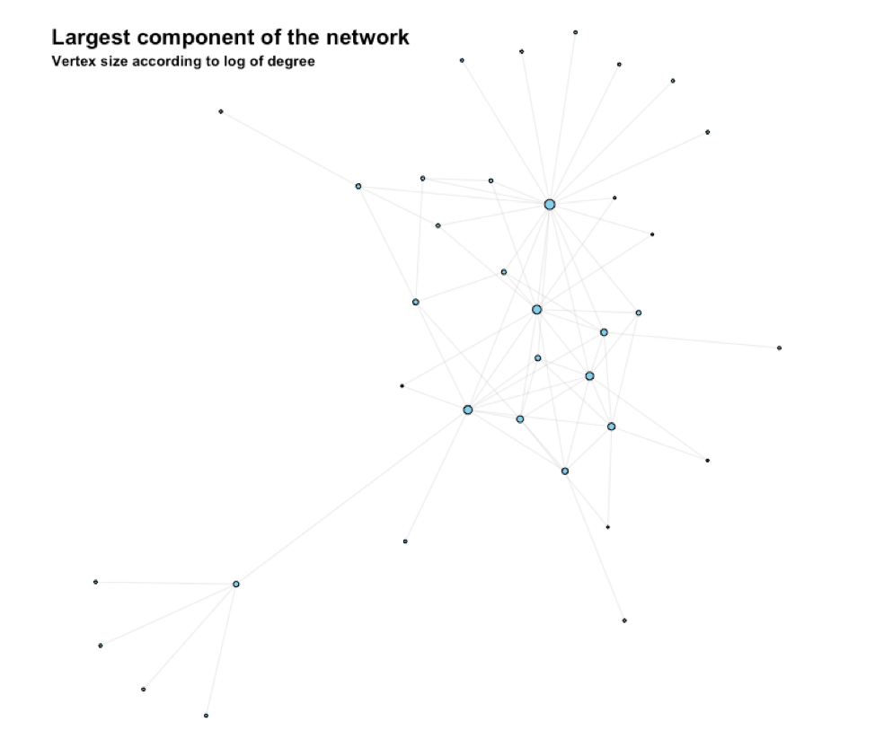
This network consists of two clusters. We extract the largest component and then have:
> summary(usa7)
IGRAPH 6881ea4 UN-- 36 71 -- US airports
+ attr:name (g/c), name (v/c), City (v/c), Position (v/c), Departures (e/n), Seats (e/n),| Passengers (e/n), Distance (e/n)
This largest component is shown in Figure 6.
We are finally ready for community analysis. Modularity is an internal quality measure of clustering. This is an ideal measure when the ground truth for the 'correctness' of a cluster is not known. I will use this measure. Next, i will submit the network to a number of algorithms to identify communities.
Figure 7 shows the edge-betweenness communities. This algorithm identifies three communities with a modularity of 0.31. One is centralized around Atlanta, GA. Another consists of the airports on the Hawaiian Islands. The third is a conglomeration of the rest of the airports.

In Figure 8 the communities identified by the leading eigenvector algorithm can be seen. These communities have a modularity of 0.33. This time we have four communities – Austin, TX and Dallas, TX form a separate community on their own. Los Angeles, CA is now part of the “Hawaii community” and so are Houston, TX and Washington, DC.

Figure 9 shows the communities identified by the Fast-greedy algorithm. The modularity is 0.34 and we now have five communities. A fifth community seems to straddle parts of the “Atlanta”, “Dallas”, and “Other” communities.
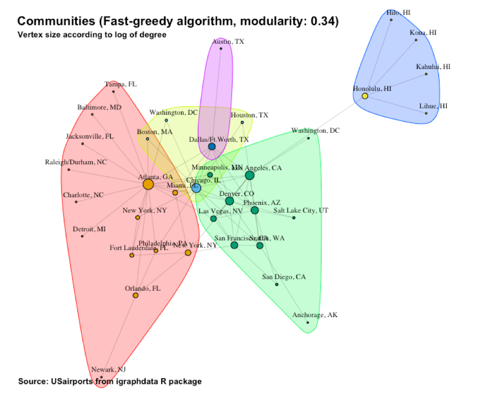
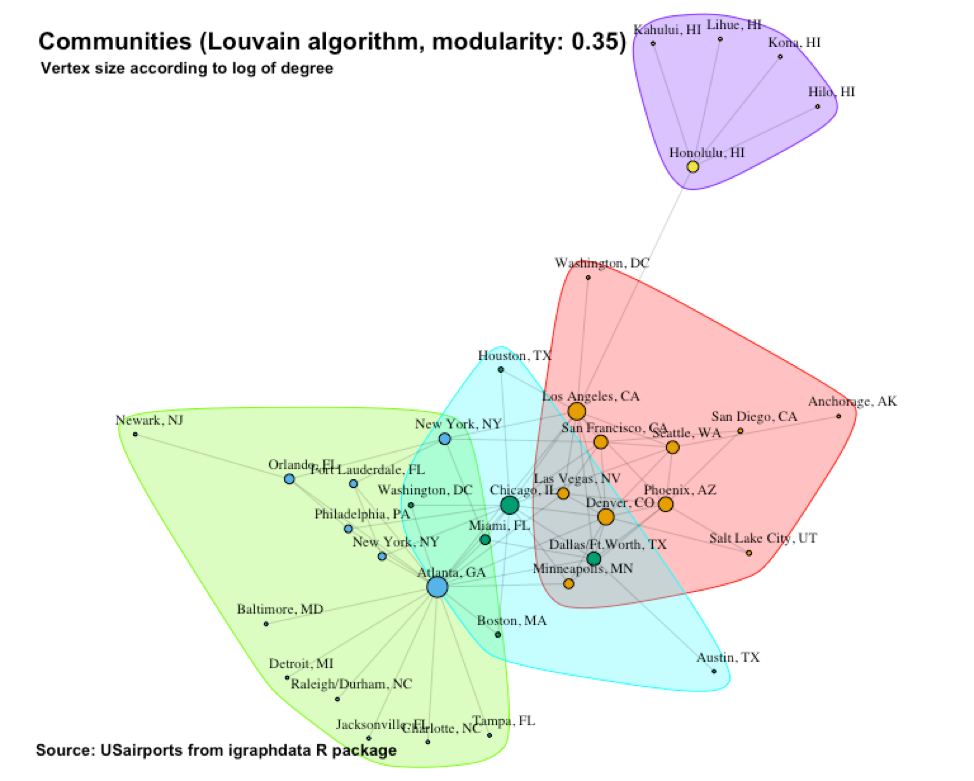
The Louvain algorithm finds four communities with a modularity of 0.35. This is shown in Figure 10. It outlines a community centralized around Chicago, IL. The Atlanta and Hawaii communities are still present as well as the “Other” more “mesh-like” community.
In Figure 11 we see the communities outlined by the Walktrap algorithm. The algorithm calculates a modularity of 0.31. We are back to three communities, much like the edge-betweenness algorithm’s result. There is a community centered around Atlanta, one centered around Honolulu, and a “other” community that contains the rest of the airports.
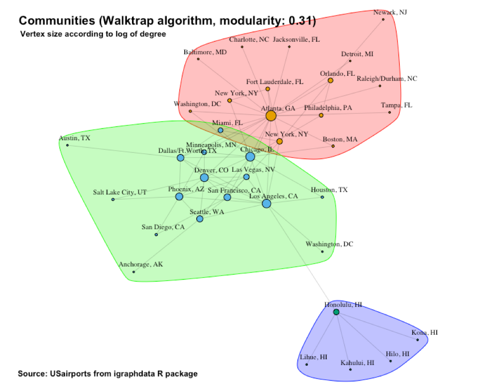
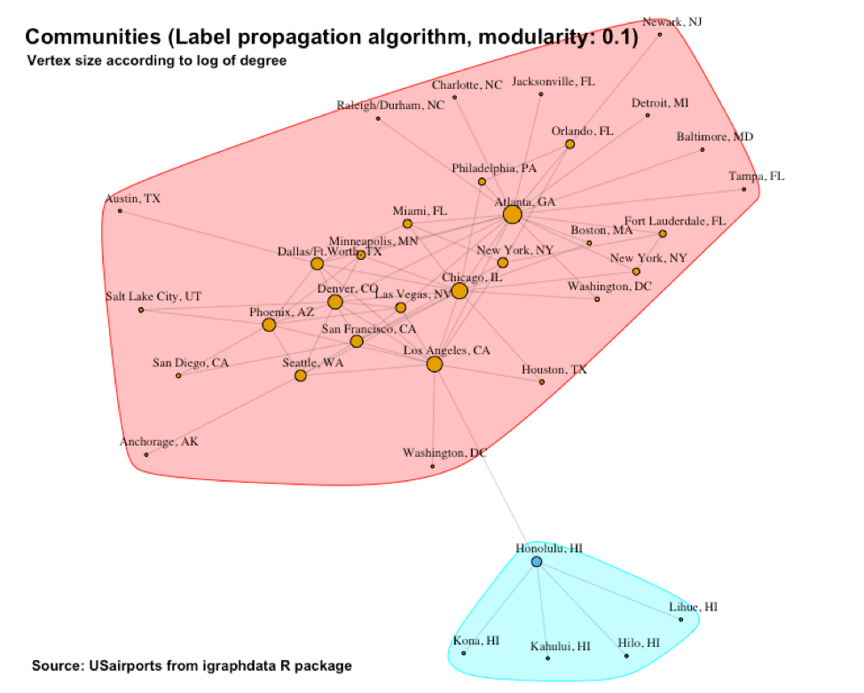
Figure 12 shows the communities identified by the label propagation algorithm with a modularity of 0.10. This time we only have two communities: One centered around Honolulu and a second one that contains the rest of the airports. The crudeness of this partitioning is reflected in the relatively low modularity score of 0.10.
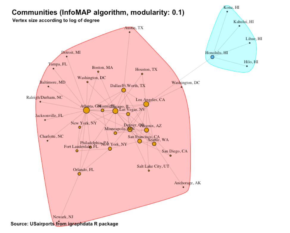
In Figure 13 we see the communities outlined by the InfoMAP algorithm. Again, we have a relatively low modularity of 0.10. The two communities identified resembles those from the previous label propagation algorithm.
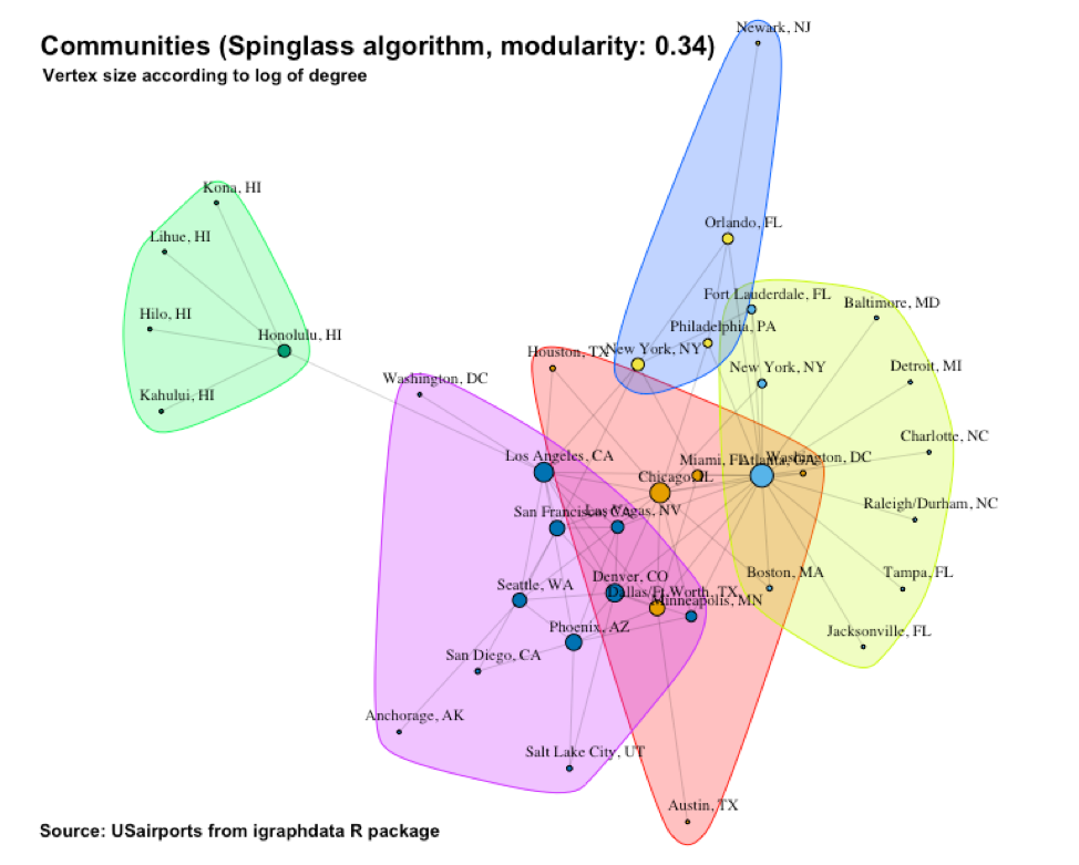
The communities identified by the Spinglass algorithm appears in Figure 14. Here we have a modularity of 0.34. Except for the “Hawaii” cluster, we have a somewhat novel partitioning this time.
To me, the most interesting community structure was provided by the edge-betweenness algorithm. This structure is repeated in Figure 15 and has a modularity of 0.31. It cleanly partitions the vertices into three communities. One community is strongly centered around Atlanta, GA. It has a particularly central and strong hub (Atlanta) from where a number of “spokes” emanates to smaller airports. This is not a surprise. Most Americans know that Atlanta is a world-wide flight hub. Due to its star-like structure, we expect the density of the subgraph associated with this “Atlanta” community to be low. Indeed, when we form an induced subgraph and calculate its density we get a density of only 0.16:
> community_density(usa7, V(usa7)[ceb[[1]]]) #Atlanta
[1] 0.1648352
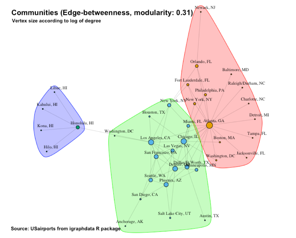
The second community is centered around Honolulu, HI and also has a star structure. This is interesting because the algorithm considers this tiny cluster of only 5 vertices as a “peer” of the other two communities. Once again, this is in line with our expectation. The flight data was collected in December of 2010 which means it is winter in the USA. The fact that the Hawaii cluster is so prominent reflects the substantial holiday traffic associated with this tropical island during the mainland’s winter season. Add to this the fact that the Hawaiian Islands can only (reasonably) be visited by flying there (i.e. no driving) and you have a very “worthy” airport community.
Due to its star-like structure, we also expect the density of the subgraph associated with the “Hawaii” community to be low. However, it has a very small number of vertices and there are not many more links that can be made. So, its density turns out to be 0.4:
> community_density(usa7, V(usa7)[ceb[[3]]]) #Hawaii
[1] 0.4
The third community is interesting in the sense that it almost resembles a random (Erdos-Renyi) network (Erdos, Renyi, 1959). It seems like the relatively large airports contained within it compete with each other to be larger hubs and in the process, ends up more-or-less as “peers.” This random appearance suggests that the subgraph associated with this “Other” community might be denser, and indeed it is when compared with the “Atlanta” community which has a density of only 0.16. This community has a density of 0.28:
> community_density(usa7, V(usa7)[ceb[[2]]]) #Others
[1] 0.2794118
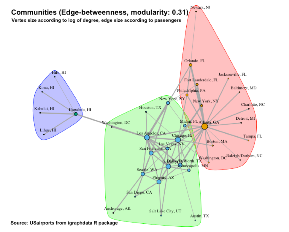
For a final visualization of our most interesting community structure we size the edge width according to the total number of passengers flowing back and forth along each edge. See Figure 16. Indeed, we see how relatively strong the flow towards and within the Hawaii community is.
I will now add two additional vertex attributes to the network to make analysis more interesting. I suspect that the population of an airport’s city might have an effect on the network’s model. Accordingly, I obtained population information from the 2010 US Census, https://www.census.gov/programs-surveys/decennial-census/decade.2010.html. I stored this data in a new numeric vertex attribute called Population.
Another variable I thought might play a role is whether an airport’s city is a coastal city. For this, I added a new boolean vertex variable called Coastal.
I will now use ERGM to build progressively richer and more accurate models for the network. The first model is the null model.
Using only the edge feature, I got this model (called null.mod in the R code):
==========================
Summary of model fit
==========================

Formula:   usa.n ~ edges

Iterations:  5 out of 20

Monte Carlo MLE Results:
      Estimate Std. Error MCMC % z value Pr(>|z|)
edges   -2.063      0.126      0  -16.38   <1e-04 ***
---
Signif. codes:  0 ‘***’ 0.001 ‘**’ 0.01 ‘*’ 0.05 ‘.’ 0.1 ‘ ’ 1

     Null Deviance: 873.4  on 630  degrees of freedom
 Residual Deviance: 443.7  on 629  degrees of freedom

AIC: 445.7    BIC: 450.1    (Smaller is better.)
The coefficient of edges is significant and is negative (-2.063) which shows that the density of the network is less than 50% (a coefficient of 0 indicates a 50% density). It is typical of real networks to have a density less than 50%. Indeed, the R code reveals that the density of the network is 0.1126984. This value is also the probability of creating an additional edge by adding one more node. The null model gives an AIC value of 445.7.
Adding the population data to the existing model, I get the following model (called pop.mod in the R code):
==========================
Summary of model fit
==========================

Formula:   usa.n ~ edges + nodecov("Population")

Iterations:  4 out of 20

Monte Carlo MLE Results:
                     Estimate Std. Error MCMC % z value Pr(>|z|)
edges              -2.332e+00  1.743e-01      0 -13.375   <1e-04 ***
nodecov.Population  1.023e-07  4.097e-08      0   2.496   0.0126 *
---
Signif. codes:  0 ‘***’ 0.001 ‘**’ 0.01 ‘*’ 0.05 ‘.’ 0.1 ‘ ’ 1

     Null Deviance: 873.4  on 630  degrees of freedom
 Residual Deviance: 438.0  on 628  degrees of freedom

AIC: 442    BIC: 450.9    (Smaller is better.)
The low p value of nodecov.Population shows that the coefficient of nodecov.Population is somewhat significant in predicting the connection between two airport nodes. For example, the likelihood of a flight connection between two cities with population of 1 and 2 million respectively, is:
plogis(-2.332 + 1.023e-07*1 + 1.023e-07*2) = 0.08850721
This value is smaller than the density of the network (0.1126984) which indicates that the role of the population in the present model is not very helpful in the prediction of a connection. Even so, the AIC value of this model is a little lower than that of the null model.
Next, I will use homophily to see if matches between Coastal values of vertices might help. Doing this, I got the following model (called hom.mod in the R code):
==========================
Summary of model fit
==========================

Formula:   usa.n ~ edges + nodecov("Population")
                         + nodematch("Coastal", diff = F)

Iterations:  5 out of 20

Monte Carlo MLE Results:
                     Estimate Std. Error MCMC % z value Pr(>|z|)
edges              -2.821e+00  2.524e-01      0 -11.176  < 1e-04 ***
nodecov.Population  1.103e-07  4.188e-08      0   2.634  0.00843 **
nodematch.Coastal   8.241e-01  2.671e-01      0   3.085  0.00203 **
---
Signif. codes:  0 ‘***’ 0.001 ‘**’ 0.01 ‘*’ 0.05 ‘.’ 0.1 ‘ ’ 1

     Null Deviance: 873.4  on 630  degrees of freedom
 Residual Deviance: 428.0  on 627  degrees of freedom

AIC: 434    BIC: 447.3    (Smaller is better.)
The low p value of nodematch.Coastal shows that its coefficient is significant in predicting the connection between two airport vertices. (We notice that the significance of the nodecov.Population parameter has improved too.) For example, the likelihood of a flight connection between two cities with population of 1 and 2 million respectively, and matching Coastal values is:
plogis(-2.821 + 1.103e-07*1 + 1.103e-07*2 + 8.241e-01)=0.1195288
This value is larger than the density of the network (0.1126984) which indicates that the effect of whether an airport is at the coast or not is indeed helpful in the prediction of a connection. In addition, the AIC has improved too, now at 434.
I will now use homophily of the Coastal vertex attribute in a more in-depth way, known as differential homophily. This means we will match for both No-No as well as Yes-Yes. Doing so gave me the following model (called difhom1.mod in the R code):
==========================
Summary of model fit
==========================

Formula:   usa.n ~ edges + nodecov("Population")
                         + nodematch("Coastal", diff=TRUE)

Iterations:  5 out of 20

Monte Carlo MLE Results:
                          Estimate Std. Error MCMC % z value Pr(>|z|)
edges                   -2.905e+00  2.642e-01      0 -10.994  < 1e-04 ***
nodecov.Population       1.355e-07  4.513e-08      0   3.002 0.002686 **
nodematch.Coastal.FALSE  1.070e+00  2.982e-01      0   3.587 0.000334 ***
nodematch.Coastal.TRUE   4.444e-01  3.567e-01      0   1.246 0.212748
---
Signif. codes:  0 ‘***’ 0.001 ‘**’ 0.01 ‘*’ 0.05 ‘.’ 0.1 ‘ ’ 1

     Null Deviance: 873.4  on 630  degrees of freedom
 Residual Deviance: 424.8  on 626  degrees of freedom

AIC: 432.8    BIC: 450.6    (Smaller is better.)
We see that the significance of nodematch.Coastal.FALSE is higher than the significance of nodematch.Coastal in the previous model. In our example, the likelihood of a flight connection between two cities with population of 1 and 2 million respectively, and miss-matching Coastal values is:
plogis(-2.905 + 1.335e-07*1 + 1.335e-07*2 + 1*1.070)= 0.1376438
The AIC value is even better (lower), now at 432.8.
I will now use differential homophily of the Coastal vertex attribute to only match for No-No. This gave me the following model (called difhom2.mod in the R code):
==========================
Summary of model fit
==========================

Formula: usa.n ~ edges + nodecov("Population")
                       + nodematch("Coastal", diff=TRUE, keep=1)

Iterations:  5 out of 20

Monte Carlo MLE Results:
                          Estimate Std. Error MCMC % z value Pr(>|z|)
edges                   -2.790e+00  2.418e-01      0 -11.535  < 1e-04 ***
nodecov.Population       1.435e-07  4.477e-08      0   3.206 0.001347 **
nodematch.Coastal.FALSE  9.397e-01  2.737e-01      0   3.433 0.000597 ***
---
Signif. codes:  0 ‘***’ 0.001 ‘**’ 0.01 ‘*’ 0.05 ‘.’ 0.1 ‘ ’ 1

     Null Deviance: 873.4  on 630  degrees of freedom
 Residual Deviance: 426.3  on 627  degrees of freedom

AIC: 432.3    BIC: 445.7    (Smaller is better.)
We see that the significance of all the previous parameters have remained. In addition, the AIC value is slightly lower to 432.3.
This time I will have the Coastal vertex attribute to only match for Yes-Yes. This gave me the following model (called difhom2.mod in the R code):
==========================
Summary of model fit
==========================

Formula: usa.n ~ edges + nodecov("Population")
                       + nodematch("Coastal", diff=T, keep=2)

Iterations:  4 out of 20

Monte Carlo MLE Results:
                         Estimate Std. Error MCMC % z value Pr(>|z|)
edges                  -2.334e+00  1.791e-01      0 -13.035   <1e-04 ***
nodecov.Population      1.017e-07  4.183e-08      0   2.432    0.015 *
nodematch.Coastal.TRUE  1.992e-02  3.196e-01      0   0.062    0.950
---
Signif. codes:  0 ‘***’ 0.001 ‘**’ 0.01 ‘*’ 0.05 ‘.’ 0.1 ‘ ’ 1

     Null Deviance: 873.4  on 630  degrees of freedom
 Residual Deviance: 438.0  on 627  degrees of freedom

AIC: 444    BIC: 457.3    (Smaller is better.)
This time we have a weaker model in terms of the significance of the parameter estimates. In addition, the AIC value is up to 444.
To try and improve the model further I will add some relational predictors. This means information about ties among the network members is used to predict the likelihood of the dependent variable tie. No matter how I combined edge attributes, I always got a model that did not converge:
==========================
Summary of model fit
==========================

Formula: usa.n ~ edges
               + nodecov("Population")
+ nodematch("Coastal", diff = T, keep = 1)
+ edgecov(usa.n, attr = "Departures")
+ edgecov(usa.n, attr = "Seats")
+ edgecov(usa.n, attr = "Passengers")
+ edgecov(usa.n, attr = "Distance")

Iterations:  25 out of 20

Monte Carlo MLE Results:
                          Estimate Std. Error MCMC % z value Pr(>|z|)
edges                   -2.684e+01  2.559e+04      0  -0.001    0.999
nodecov.Population      -6.178e-09  6.083e-03      0   0.000    1.000
nodematch.Coastal.FALSE  1.447e+00  2.587e+04      0   0.000    1.000
edgecov.Departures       3.049e-02  1.231e+03      0   0.000    1.000
edgecov.Seats           -8.836e-04  2.166e+01      0   0.000    1.000
edgecov.Passengers       1.720e-03  1.664e+01      0   0.000    1.000
edgecov.Distance         3.731e-03  7.526e+01      0   0.000    1.000

     Null Deviance: 8.734e+02  on 630  degrees of freedom
 Residual Deviance: 7.314e-09  on 623  degrees of freedom

AIC: 14    BIC: 45.12    (Smaller is better.)
Lastly, I tried to include a predictor that uses local structural properties. This gave me the following model (called dyad.mod in the R code):
==========================
Summary of model fit
==========================

Formula:   usa.n ~ edges
                   + nodecov("Population")
                   + nodematch("Coastal", diff = T, keep = 1)
                   + gwesp(0.7, fixed = TRUE)

Iterations:  3 out of 20

Monte Carlo MLE Results:
                          Estimate Std. Error MCMC %  z value Pr(>|z|)
edges                   -3.533e+00  4.262e-03    100 -828.828   <1e-04 ***
nodecov.Population       7.585e-08  1.472e-08      0    5.153   <1e-04 ***
nodematch.Coastal.FALSE  5.196e-01  3.694e-03    100  140.663   <1e-04 ***
gwesp.fixed.0.7          6.979e-01  2.173e-03    100  321.149   <1e-04 ***
---
Signif. codes:  0 ‘***’ 0.001 ‘**’ 0.01 ‘*’ 0.05 ‘.’ 0.1 ‘ ’ 1

     Null Deviance: 873.4  on 630  degrees of freedom
 Residual Deviance: 397.6  on 626  degrees of freedom

AIC: 405.6    BIC: 423.3    (Smaller is better.)
Not only did this approach have a wholesome effect on the significance of all the parameters I used, but it also lowered the AIC value to 405.6.
I will next investigate the goodness-of-fit of the above models.
The simulation statistics show that the dyad.mod (the last model) seems to perform better than the other models, in particular in the case of triangles:
edges degree0 degree1 degree2 degree3 degree4 degree5 triangle
usa.n          71       0      14       5       3       3       3       47
null.mod       83       0       2       3       6       6       9       15
hom.mod        69       0       4       4       6      12       4        9
difhom1.mod    69       0       3       6       8       8       5        8
difhom2.mod    74       1       4       4       8       3       2       12
difhom3.mod    79       0       2       0       8      10       7       13
dyad.mod       84       2       5       4       4       5       2       50
Next I will plot some charts that will indicate the goodness-of-fit of the best model: dyad.mod. See Figure 17. When the dark line falls within the gray lines it indicates a good fit. The gray lines indicate the confidence interval. As is evident from Figure 17 and Figure 18, most elements have been fitted well.
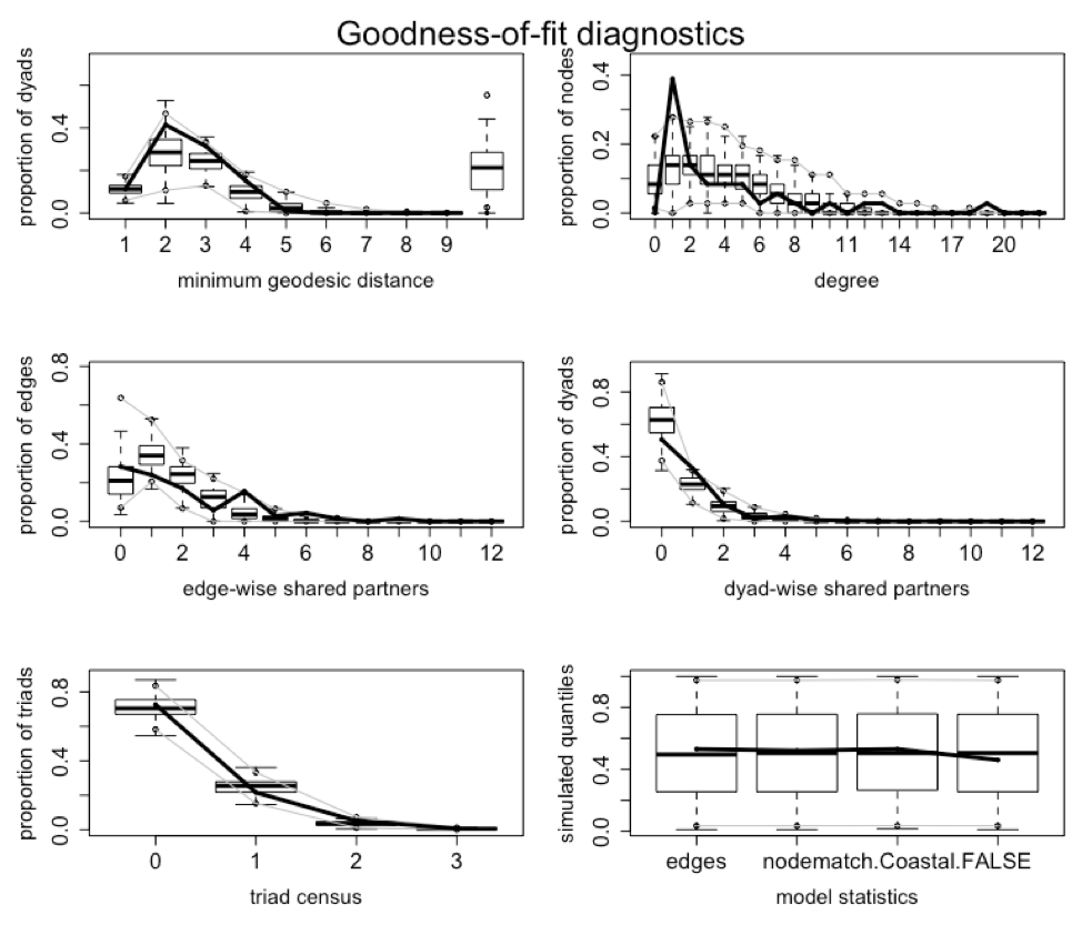
Figure 18 shows the same information except for the vertical axes that are calibrated to display log-odds values.
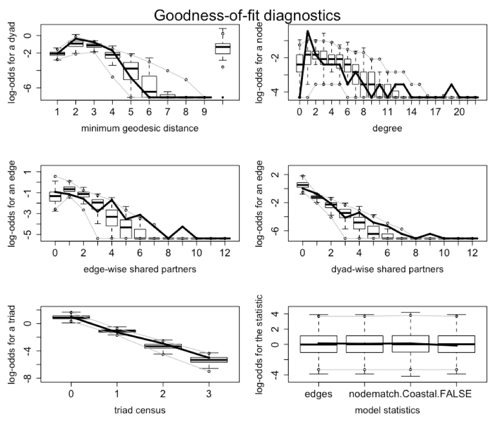
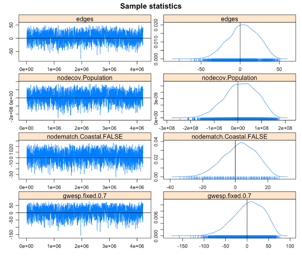
Figure 19 shows the MCMC goodness-of-fit diagnostics.
Lastly, we will look at the p-values of the goodness-of-fit simulations. When p-values are high it shows that there are no significant differences between the simulated networks and the original network. The problematic p-values have been highlighted. In terms of minimum geodesic distance, we have a good fit. For degree, we have a good fit except for degree values of 1 and 19. In the case of edgewise shared partner, we have a good fit. For dyadwise shared partner, the only problem is at dsp1. Triad census shows a good fit too. The same is true for the model statistics.
> dyad.mod.gof #goodness-of-fit for the dyad.mod network

Goodness-of-fit for minimum geodesic distance

    obs min   mean max MC p-value
1    71  24  71.33 123       1.00
2   261  28 178.31 333       0.18
3   198  31 152.75 225       0.24
4    95   3  62.22 147       0.22
5     5   0  18.87  69       0.52
6     0   0   5.26  45       0.98
7     0   0   1.43  27       1.00
8     0   0   0.34  12       1.00
9     0   0   0.09   5       1.00
10    0   0   0.03   2       1.00
Inf   0   0 139.37 454       0.06

Goodness-of-fit for degree

   obs min mean max MC p-value
0    0   0 3.71  10       0.06
1   14   0 4.76  16       0.02
2    5   1 5.11  11       1.00
3    3   0 4.72  13       0.64
4    3   1 4.16  10       0.80
5    3   1 3.69   8       0.98
6    1   0 3.03   9       0.48
7    2   0 2.21   6       1.00
8    1   0 1.52   7       1.00
9    0   0 1.13   4       0.78
10   1   0 0.79   5       0.90
11   0   0 0.42   3       1.00
12   1   0 0.31   4       0.50
13   1   0 0.21   2       0.34
14   0   0 0.11   2       1.00
15   0   0 0.05   1       1.00
16   0   0 0.03   1       1.00
17   0   0 0.01   1       1.00
18   0   0 0.03   1       1.00
19   1   0 0.00   0       0.00

Goodness-of-fit for edgewise shared partner

     obs min  mean max MC p-value
esp0  20   3 14.90  33       0.34
esp1  17   4 23.98  41       0.26
esp2  12   1 17.16  38       0.52
esp3   4   0  9.25  26       0.52
esp4  11   0  3.92  22       0.22
esp5   2   0  1.46   9       0.66
esp6   3   0  0.46   5       0.08
esp7   1   0  0.17   4       0.22
esp9   1   0  0.03   1       0.06

Goodness-of-fit for dyadwise shared partner

     obs min   mean max MC p-value
dsp0 318 182 395.26 597       0.32
dsp1 206  31 142.54 201       0.00
dsp2  66   2  59.01 140       0.74
dsp3  10   0  21.69  71       0.52
dsp4  20   0   7.90  46       0.18
dsp5   5   0   2.62  15       0.40
dsp6   3   0   0.73   8       0.22
dsp7   1   0   0.21   5       0.24
dsp8   0   0   0.01   1       1.00
dsp9   1   0   0.03   1       0.06

Goodness-of-fit for triad census

   obs  min    mean  max MC p-value
0 5186 3732 5053.56 6357       0.84
1 1541  752 1785.41 2728       0.48
2  366   29  263.28  592       0.40
3   47    2   37.75   97       0.54

Goodness-of-fit for model statistics

                                 obs          min         mean          max MC p-value
edges                   7.100000e+01 2.400000e+01 7.133000e+01 1.230000e+02       1.00
nodecov.Population      2.182382e+08 6.183536e+07 2.176689e+08 3.786887e+08       0.96
nodematch.Coastal.FALSE 3.200000e+01 1.200000e+01 3.229000e+01 5.600000e+01       0.94
gwesp.fixed.0.7         7.664400e+01 5.503415e+00 7.757239e+01 1.734378e+02       0.92
>
Gabor, Csardi. igraphdata: A Collection of Network Data Sets for the 'igraph' Package, 2015.
Erdos, P., Renyi, A. On Random Graphs, 1959.
CRAN repository, igraphdata. https://cran.r-project.org/web/packages/igraphdata/igraphdata.pdf
RITA. The Research and Innovative Technology Administration, 2010. http://www.rita.dot.gov/about_rita/